Today's reading is the first in a series about graphic design for graphical user interfaces. We'll discuss two major principles of visual design: simplicity and contrast.
 Although we'll largely be looking at simplicity in graphic design today, the value of simplicity to user interface design is much broader than that. Keeping a design simple, with as few parts and pieces as you can, tends to improve a design on all our usability dimensions: learnability, efficiency, and safety.
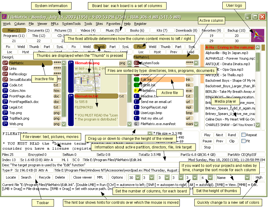
Here's a counterexample to illustrate. This is a program called FileMatrix. I have no idea what it does, but it seems to do it all. The complexity of this interface actually interferes with a lot of our usability goals: it's less learnable (because there are so many things you have to learn), less efficient (because cramming all the functions into the window means that each button is tiny), and less safe (because so many things look alike, hence description slips are easy).
Here are three ways to make a design simpler. Again, we're focusing on graphic design (visual appearance here), but you can generalize these rules easily to other aspects of a design: the features that your application offers, the labels for buttons or form fields, the steps in a process, etc.
**Reduction** means that you eliminate whatever isn't necessary. This technique has three steps:
1. decide what essentially needs to be conveyed by the design
2. critically examine every element (label, control, color, font, line weight) to decide whether it serves an essential purpose
3. remove it if it isn't essential. Even if it seems essential, try removing it anyway, to see if the design falls apart.
**Icons** demonstrate the principle of reduction well. A *photograph* of a pair of scissors can't possibly work as a 32x32 pixel icon; instead, it has to be a carefully-drawn picture which includes the bare minimum of details that are essential to scissors: two lines for the blades, two loops for the handles. The standard US Department of Transportation symbol for handicapped access is likewise a marvel of reduction. No element remains that can be removed from it without destroying its meaning.
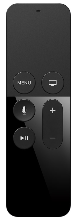
The Apple TV remote is another notable example, about minimalizing **functionality**. It’s much simpler than comparable remote controls, which tend to be dense arrays of tiny rectangular buttons, all alike. Functionality has been aggressively removed from the remote, and replaced by onscreen UI or speech dialog UI.
Although we'll largely be looking at simplicity in graphic design today, the value of simplicity to user interface design is much broader than that. Keeping a design simple, with as few parts and pieces as you can, tends to improve a design on all our usability dimensions: learnability, efficiency, and safety.
Here's a counterexample to illustrate. This is a program called FileMatrix. I have no idea what it does, but it seems to do it all. The complexity of this interface actually interferes with a lot of our usability goals: it's less learnable (because there are so many things you have to learn), less efficient (because cramming all the functions into the window means that each button is tiny), and less safe (because so many things look alike, hence description slips are easy).
Here are three ways to make a design simpler. Again, we're focusing on graphic design (visual appearance here), but you can generalize these rules easily to other aspects of a design: the features that your application offers, the labels for buttons or form fields, the steps in a process, etc.
**Reduction** means that you eliminate whatever isn't necessary. This technique has three steps:
1. decide what essentially needs to be conveyed by the design
2. critically examine every element (label, control, color, font, line weight) to decide whether it serves an essential purpose
3. remove it if it isn't essential. Even if it seems essential, try removing it anyway, to see if the design falls apart.
**Icons** demonstrate the principle of reduction well. A *photograph* of a pair of scissors can't possibly work as a 32x32 pixel icon; instead, it has to be a carefully-drawn picture which includes the bare minimum of details that are essential to scissors: two lines for the blades, two loops for the handles. The standard US Department of Transportation symbol for handicapped access is likewise a marvel of reduction. No element remains that can be removed from it without destroying its meaning.
The Apple TV remote is another notable example, about minimalizing **functionality**. It’s much simpler than comparable remote controls, which tend to be dense arrays of tiny rectangular buttons, all alike. Functionality has been aggressively removed from the remote, and replaced by onscreen UI or speech dialog UI.
 For the essential elements that remain, consider how you can minimize the unnecessary differences between them with **regularity**. Use the same font, color, line width, dimensions, orientation for multiple elements. Irregularities in your design will be magnified in the user's eyes and assigned meaning and significance. Conversely, if your design is mostly regular, the elements that you do want to highlight will stand out better.
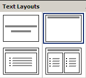
PowerPoint's Text Layouts menu shows both reduction (minimalist icons representing each layout) and regularity. Titles and bullet lists are shown the same way.
Another technique for simplicity is **double duty**, in which you try to combine elements to make them serve multiple roles in the design. Desktop and web interfaces have a number of patterns in which elements have multiple duties. For example, the "thumb" in a scroll bar actually serves three roles. It affords dragging, indicates the position of the scroll window relative to the entire document, and indicates the fraction of the document displayed in the scroll window. Similarly, a window's title bar plays several roles: label, dragging handle, window activation indicator, and location for window control buttons. In the classic Mac interface, in fact, even the activation indicator played two roles. When the window was activated, closely spaced horizontal lines filled the title bar, giving it a perceived affordance for dragging.
The breadcrumbs pattern and the pagination pattern also do double duty, not only showing you where you are but also providing an affordance for navigating somewhere else. Pagination links, like a scrollbar, may also show you how many pages there are.
Netflix star ratings initially show how other users have rated a movie (red stars), but also serve as an input affordance for entering the user’s own rating (gold stars).
For the essential elements that remain, consider how you can minimize the unnecessary differences between them with **regularity**. Use the same font, color, line width, dimensions, orientation for multiple elements. Irregularities in your design will be magnified in the user's eyes and assigned meaning and significance. Conversely, if your design is mostly regular, the elements that you do want to highlight will stand out better.
PowerPoint's Text Layouts menu shows both reduction (minimalist icons representing each layout) and regularity. Titles and bullet lists are shown the same way.
Another technique for simplicity is **double duty**, in which you try to combine elements to make them serve multiple roles in the design. Desktop and web interfaces have a number of patterns in which elements have multiple duties. For example, the "thumb" in a scroll bar actually serves three roles. It affords dragging, indicates the position of the scroll window relative to the entire document, and indicates the fraction of the document displayed in the scroll window. Similarly, a window's title bar plays several roles: label, dragging handle, window activation indicator, and location for window control buttons. In the classic Mac interface, in fact, even the activation indicator played two roles. When the window was activated, closely spaced horizontal lines filled the title bar, giving it a perceived affordance for dragging.
The breadcrumbs pattern and the pagination pattern also do double duty, not only showing you where you are but also providing an affordance for navigating somewhere else. Pagination links, like a scrollbar, may also show you how many pages there are.
Netflix star ratings initially show how other users have rated a movie (red stars), but also serve as an input affordance for entering the user’s own rating (gold stars).
 **Contrast** refers to perceivable differences along a visual dimension, such as size or color. Contrast is the irregularity in a design that communicates information or makes elements stand out. Simplicity says we should eliminate **unimportant** differences. Once we've decided that a difference is important, however, we should choose the dimension and degree of contrast in such a way that the difference is salient, easily perceptible, and appropriate to the task.
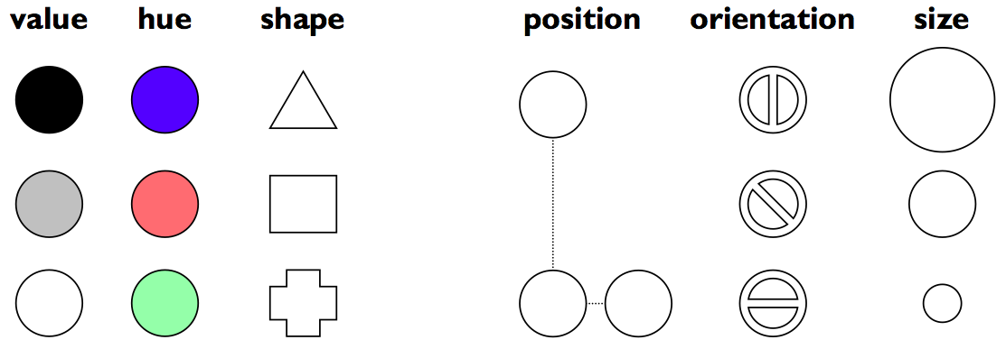
Crucial to this decision is an understanding of the different visual dimensions. Jacques Bertin developed a theory of *visual variables* that is particularly useful here (Bertin, *Graphics and Graphics Information Processing*, 1989). Visual variables identified by Bertin are shown above. Bertin called these dimensions *retinal variables*, in fact, because they can be compared effortlessly without additional cognitive processing, as if the retina were doing all the work.
Each column in this display varies along only one of the six variables. Most of the variables need no explanation, except perhaps for hue and value. **Hue** is pure color; **value** is the brightness or luminance of color. (Figure after Mullet & Sano, p. 54).
The visual variables are used for communication, by encoding data and drawing distinctions between visual elements. But the visual variables have different characteristics. Before you choose a visual variable to express some distinction, you should make sure that the visual variable's properties match your communication. For example, you could display a temperature using any of the dimensions: position on a scale, length of a bar, color of an indicator, or shape of an icon (a happy sun or a chilly icicle). Your choice of visual variable will strongly affect how your users will be able to perceive and use the displayed data.
Two characteristics of visual variables are the kind of **scale** and the **length** of the scale.
A **nominal** scale is just a list of categories. Only comparison for equality is supported by a nominal scale. Different items in a nominal scale have no ordering relationship. The shape variable is purely nominal. Hue is also purely nominal, at least as a *perceptual* variable. Although the wavelength of light assigns an ordering to colors, the human perceptual system takes no notice of it. Likewise, there may be some cultural ordering imposed on hue (red is "hotter" than blue), but it's weak, doesn't relate all the hues, and is processed at a higher cognitive level.
An **ordered** scale adds an ordering to the items on the scale. Position, size, and value are all ordered.
With a **quantitative** variable, you can perceive the amount of difference in the ordering. Position is quantitative. You can look at two points on a graph and tell that one is twice as high as the other. Size is also quantitative, but note that we are far better at perceiving quantitative differences in one dimension (i.e., length) than in two dimensions (area). Value is not quantitative; we can't easily perceive that one shade is twice as dark as another shade.
The **length** of a variable is the number of distinguishable levels that can be perceived. We can recognize a nearly infinite variety of shapes, so the shape variable is very long, but purely nominal. Position is also long, and particularly fine-grained. Orientation, by contrast, is very short; only a handful of different orientations can be perceived in a display before confusion starts to set in. The other variables lie somewhere in between, with roughly 10 useful levels of distinction, although size and hue are somewhat longer than value.
There are two ways that your choice of visual variables can affect the user's ability to attend to them.
**Selectivity** is the degree to which a single level of the variable can be selected from the entire visual field. Most variables are selective: e.g., you can locate green objects at a glance, or tiny objects. Shape, however, is not selective in general. It's hard to pick out triangles amidst a sea of rectangles.
**Associativity** refers to how easy it is to ignore the variable, letting all of the distinctions along that dimension disappear. Variables with poor associativity interfere with the perception of other visual dimensions. In particular, size and value are dissociative, since tiny or faint objects are hard to make out.
Once you've decided that a contrast is essential in your interface, **choose the right visual variable** to represent it, keeping in mind the data you're trying to communicate and the task users need to do with the data. For example, consider a text content hierarchy: title, chapter, section, body text, footnote. The data requires an ordered visual variable; a purely nominal variable like shape (e.g., font family) would not by itself be able to communicate the hierarchy ordering. If each element must communicate multiple independent dimensions of data at once (e.g., a graph that uses size, position, and color of points to encode different data variables), then you need to think about the effects of associativity and selectivity.
Once you've chosen a variable, use as much of the **length** of the variable as you can. Determine the minimum and maximum level of the variable you can use, and exploit the whole range. In the interests of simplicity, you should minimize the number of distinct levels you use. But once you've settled on N levels, distribute those N levels as widely across the variable as is reasonable. For position, this means using the full width of the window; for size, it means using the smallest and the largest feasible sizes.
Choose variable levels in such a way as to make **sharp, easily perceptible distinctions** between them. Multiplicative scaling (e.g., size growing by a factor of 1.5 or 2 at each successive level) makes sharper distinctions than additive scaling (e.g., adding 5 pixels at each successive level). You can also use redundant coding, in several visual variables, to enhance important distinctions further. The title of a document is not only larger (size), but it's also centered (position), bold (value), and maybe a distinct color as well. Exaggerated differences can be useful, particularly when you're drawing icons: like a cartoonist, you have to give objects exaggerated proportions to make them easily recognizable.
The **squint test** is a technique that simulates early visual processing, so you can see whether the contrasts you've tried to establish are readily apparent. Close one eye and squint the other, to disrupt your focus. Whatever distinctions you can still make out will be visible "at a glance."
**Contrast** refers to perceivable differences along a visual dimension, such as size or color. Contrast is the irregularity in a design that communicates information or makes elements stand out. Simplicity says we should eliminate **unimportant** differences. Once we've decided that a difference is important, however, we should choose the dimension and degree of contrast in such a way that the difference is salient, easily perceptible, and appropriate to the task.
Crucial to this decision is an understanding of the different visual dimensions. Jacques Bertin developed a theory of *visual variables* that is particularly useful here (Bertin, *Graphics and Graphics Information Processing*, 1989). Visual variables identified by Bertin are shown above. Bertin called these dimensions *retinal variables*, in fact, because they can be compared effortlessly without additional cognitive processing, as if the retina were doing all the work.
Each column in this display varies along only one of the six variables. Most of the variables need no explanation, except perhaps for hue and value. **Hue** is pure color; **value** is the brightness or luminance of color. (Figure after Mullet & Sano, p. 54).
The visual variables are used for communication, by encoding data and drawing distinctions between visual elements. But the visual variables have different characteristics. Before you choose a visual variable to express some distinction, you should make sure that the visual variable's properties match your communication. For example, you could display a temperature using any of the dimensions: position on a scale, length of a bar, color of an indicator, or shape of an icon (a happy sun or a chilly icicle). Your choice of visual variable will strongly affect how your users will be able to perceive and use the displayed data.
Two characteristics of visual variables are the kind of **scale** and the **length** of the scale.
A **nominal** scale is just a list of categories. Only comparison for equality is supported by a nominal scale. Different items in a nominal scale have no ordering relationship. The shape variable is purely nominal. Hue is also purely nominal, at least as a *perceptual* variable. Although the wavelength of light assigns an ordering to colors, the human perceptual system takes no notice of it. Likewise, there may be some cultural ordering imposed on hue (red is "hotter" than blue), but it's weak, doesn't relate all the hues, and is processed at a higher cognitive level.
An **ordered** scale adds an ordering to the items on the scale. Position, size, and value are all ordered.
With a **quantitative** variable, you can perceive the amount of difference in the ordering. Position is quantitative. You can look at two points on a graph and tell that one is twice as high as the other. Size is also quantitative, but note that we are far better at perceiving quantitative differences in one dimension (i.e., length) than in two dimensions (area). Value is not quantitative; we can't easily perceive that one shade is twice as dark as another shade.
The **length** of a variable is the number of distinguishable levels that can be perceived. We can recognize a nearly infinite variety of shapes, so the shape variable is very long, but purely nominal. Position is also long, and particularly fine-grained. Orientation, by contrast, is very short; only a handful of different orientations can be perceived in a display before confusion starts to set in. The other variables lie somewhere in between, with roughly 10 useful levels of distinction, although size and hue are somewhat longer than value.
There are two ways that your choice of visual variables can affect the user's ability to attend to them.
**Selectivity** is the degree to which a single level of the variable can be selected from the entire visual field. Most variables are selective: e.g., you can locate green objects at a glance, or tiny objects. Shape, however, is not selective in general. It's hard to pick out triangles amidst a sea of rectangles.
**Associativity** refers to how easy it is to ignore the variable, letting all of the distinctions along that dimension disappear. Variables with poor associativity interfere with the perception of other visual dimensions. In particular, size and value are dissociative, since tiny or faint objects are hard to make out.
Once you've decided that a contrast is essential in your interface, **choose the right visual variable** to represent it, keeping in mind the data you're trying to communicate and the task users need to do with the data. For example, consider a text content hierarchy: title, chapter, section, body text, footnote. The data requires an ordered visual variable; a purely nominal variable like shape (e.g., font family) would not by itself be able to communicate the hierarchy ordering. If each element must communicate multiple independent dimensions of data at once (e.g., a graph that uses size, position, and color of points to encode different data variables), then you need to think about the effects of associativity and selectivity.
Once you've chosen a variable, use as much of the **length** of the variable as you can. Determine the minimum and maximum level of the variable you can use, and exploit the whole range. In the interests of simplicity, you should minimize the number of distinct levels you use. But once you've settled on N levels, distribute those N levels as widely across the variable as is reasonable. For position, this means using the full width of the window; for size, it means using the smallest and the largest feasible sizes.
Choose variable levels in such a way as to make **sharp, easily perceptible distinctions** between them. Multiplicative scaling (e.g., size growing by a factor of 1.5 or 2 at each successive level) makes sharper distinctions than additive scaling (e.g., adding 5 pixels at each successive level). You can also use redundant coding, in several visual variables, to enhance important distinctions further. The title of a document is not only larger (size), but it's also centered (position), bold (value), and maybe a distinct color as well. Exaggerated differences can be useful, particularly when you're drawing icons: like a cartoonist, you have to give objects exaggerated proportions to make them easily recognizable.
The **squint test** is a technique that simulates early visual processing, so you can see whether the contrasts you've tried to establish are readily apparent. Close one eye and squint the other, to disrupt your focus. Whatever distinctions you can still make out will be visible "at a glance."
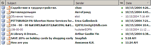 Let's look at an email inbox to see how data associated with email messages are encoded into visual variables in the display. Here are the data fields shown above, in columns from left to right:
- **Spam flag**: nominal, 2 levels (spam or not)
- **Subject**: nominal (but can be ordered alphabetically), infinite (but maybe only ~100 are active)
- **Sender**: nominal (but can be ordered alphabetically), infinite (but maybe ~100 people you know + everybody else are useful simplifications)
- **Unread flag**: nominal, 2 levels (read or unread)
- **Date**: quantitative (but maybe ordered is all that matters), infinite (but maybe only ~10 levels matter: today, this week, this month, this year, older)
This information is **redundantly** coded into visual variables in the display shown above, for better contrast. First, all the fields use position as a variable, since each is assigned to a different column. In addition:
- Spam: shape, hue, value, size (big colorful icon vs. little dot)
- Subject: shape
- Sender: shape
- Unread: shape, hue, value, size (big green dot vs. little gray dot) and value of entire line (boldface vs. non)
- Date: shape, size (today is shorter than earlier dates), position (list is sorted by date)
Let's look at an email inbox to see how data associated with email messages are encoded into visual variables in the display. Here are the data fields shown above, in columns from left to right:
- **Spam flag**: nominal, 2 levels (spam or not)
- **Subject**: nominal (but can be ordered alphabetically), infinite (but maybe only ~100 are active)
- **Sender**: nominal (but can be ordered alphabetically), infinite (but maybe ~100 people you know + everybody else are useful simplifications)
- **Unread flag**: nominal, 2 levels (read or unread)
- **Date**: quantitative (but maybe ordered is all that matters), infinite (but maybe only ~10 levels matter: today, this week, this month, this year, older)
This information is **redundantly** coded into visual variables in the display shown above, for better contrast. First, all the fields use position as a variable, since each is assigned to a different column. In addition:
- Spam: shape, hue, value, size (big colorful icon vs. little dot)
- Subject: shape
- Sender: shape
- Unread: shape, hue, value, size (big green dot vs. little gray dot) and value of entire line (boldface vs. non)
- Date: shape, size (today is shorter than earlier dates), position (list is sorted by date)
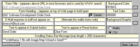 Here's an example of too little contrast. It's important to distinguish captions from text fields, but in this design, most of the visual variables are the same for both:
- the **position** is very similar: the box around each caption and text field begins at the same horizontal position. The text itself begins at different positions (left-justified vs. aligned), but it isn't a strong distinction, and some of the captions fill their column.
- the **size** is the same: captions and text fields fill the same column width
- the background **hue** is slightly different (yellow vs. white), but not easily differentiable by the squint test
- the background **value** is the same (very bright)
- the foreground **hue** and **value** are the same (black, plain font)
- the **orientation** is the horizontal, because of course you have to read it.
The result is that it's hard to scan this form. The form is also terribly crowded, which leads us into our next topic...
Here's an example of too little contrast. It's important to distinguish captions from text fields, but in this design, most of the visual variables are the same for both:
- the **position** is very similar: the box around each caption and text field begins at the same horizontal position. The text itself begins at different positions (left-justified vs. aligned), but it isn't a strong distinction, and some of the captions fill their column.
- the **size** is the same: captions and text fields fill the same column width
- the background **hue** is slightly different (yellow vs. white), but not easily differentiable by the squint test
- the background **value** is the same (very bright)
- the foreground **hue** and **value** are the same (black, plain font)
- the **orientation** is the horizontal, because of course you have to read it.
The result is that it's hard to scan this form. The form is also terribly crowded, which leads us into our next topic...
Simplicity
Designing for simplicity is a process of *elimination*, not accretion. Simplicity is in constant tension with other design guidelines that might otherwise encourage you to pile more and more elements into a design, "just in case." Simplicity forces you to have a good reason for everything you add, and to take away anything that can't survive hard scrutiny.Simplicity
Source: Alex Papadimoulis
Techniques for Simplicity: Reduction
- Remove inessential elements

- Remove inessential features
Techniques for Simplicity: Regularity
- Use a regular pattern
- Limit inessential variation among elements
Techniques for Simplicity: Double-Duty
- Combine elements for leverage
- Find a way for one element to play multiple roles
title bar: 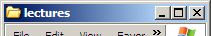
scrollbar thumb: 
breadcrumbs: 
pagination: 
help prompt: 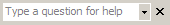
star ratings: 

Contrast
Contrast & Visual Variables
- Contrast encodes information along visual dimensions
Choosing Visual Variables for a Display
Contrast Problems
Answer this question: [Visual Design](https://docs.google.com/forms/d/e/1FAIpQLScrfvBPILk02hvQ2-wgf0smzq8b6NWFgO1yrkZ2ooWQGufq5g/viewform?usp=sf_link)
Today's reading has two parts. Go to the next reading: [Layout](../17-Layout/)